Color Theory for Manga & Anime: Mastering Digital Color on Mobile with SumiSplash
A deep dive into color theory applied to anime and manga art — warm vs. cool palettes, limited-palette storytelling, color harmony in panels, and practical techniques using SumiSplash's 5 anime palettes, eyedropper, fill tool, and layer blending.
Color Is Not Decoration — It's Narrative
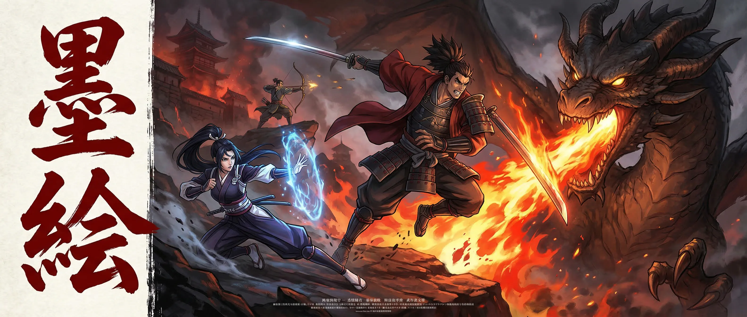
In Western comics, color is often an afterthought — lineart is drawn, then a colorist fills it in, sometimes with minimal communication about narrative intent. In anime and manga, the relationship between color and story is far more deliberate. The warm golden light of a nostalgic flashback. The cold blue desaturation of a character's despair. The explosive red saturation of a rage-fueled attack. The gentle pink softness of a first love scene. Every color choice communicates emotional information that the reader absorbs subconsciously, and professional anime colorists make these choices with the same intentionality that cinematographers choose lighting setups in film.
SumiSplash's 5 curated anime color palettes were designed with this narrative function in mind. They aren't random assortments of pretty colors — they're mood systems built on anime production color theory, each providing harmonious skin tones, hair colors, fabric tones, and accent colors calibrated to evoke a specific emotional atmosphere. Understanding why these palettes work, and how to use them beyond their defaults, transforms coloring from a mechanical fill-the-shapes task into a storytelling instrument.
This guide covers the color theory principles that underpin effective anime and manga coloring: temperature and mood, limited-palette emotional storytelling, harmony in multi-panel compositions, the roles of saturation and value in visual hierarchy, and practical techniques for applying these principles using SumiSplash's tools. The goal isn't to teach you to copy existing anime color schemes — it's to teach you to design your own, intentionally, with the same analytical vocabulary that professional anime colorists use.
Warm vs. Cool: How Color Temperature Sets Emotional Tone
Color temperature is the single most powerful emotional tool in the colorist's vocabulary. Warm colors — reds, oranges, yellows, warm pinks — activate feelings of energy, passion, comfort, nostalgia, and danger. Cool colors — blues, teals, purples, cool grays — evoke calm, sadness, isolation, mystery, and contemplation. This isn't subjective preference; it's a physiological response rooted in how the human visual system processes light. Warm wavelengths stimulate alertness and emotional engagement. Cool wavelengths promote cognitive processing and emotional distance.
In anime production, entire scenes are shifted toward warm or cool to establish mood before a single word of dialogue is spoken. Studio Ghibli's golden-hour scenes are universally warm — Spirited Away's bathhouse at sunset, Howl's Moving Castle's countryside sequences — creating an immediate sensation of wonder and emotional warmth. Conversely, the blue-shifted scenes in Ghost in the Shell and Evangelion establish technological coldness and existential isolation through color temperature alone.
SumiSplash's five anime palettes span this temperature range. Identify which palette maps to the emotional tone of your scene before you begin coloring. A warm palette for a reunion scene. A cool palette for a betrayal. A mixed palette with warm foreground subjects and a cool background for a character who feels emotionally isolated despite being in a warm environment. Temperature shifting within a single panel — warm on the character, cool on the environment — is an advanced technique that creates powerful emotional contrast.
The practical technique: start by establishing the dominant temperature of the scene. Fill the background layer with a low-opacity wash of your dominant temperature color using the Airbrush. This warm or cool undertone will influence every subsequent color you apply — even neutral colors like grays and browns will read as warm or cool depending on this underlying base. It's the colorist's equivalent of a musician establishing the key signature at the beginning of a piece.
Studio Ghibli's golden-hour warmth creates wonder. Ghost in the Shell's blue shift creates existential isolation. Color temperature sets the emotional tone before a single word of dialogue is spoken.
5 Curated Anime Palettes
Mood-calibrated color systems with harmonious skin tones, hair colors, fabric tones, and accents — each designed for a specific emotional atmosphere.
Temperature Undertone Wash
A low-opacity warm or cool base layer that shifts the entire panel's emotional register — the colorist's equivalent of a key signature.
Temperature Contrast
Warm foreground subjects against cool backgrounds create emotional isolation effects — advanced narrative coloring in a single panel.
Limited Palette Storytelling: Less Color, More Emotion
Beginning colorists make a common mistake: they use every color available. The result is visual noise — a page where the eye bounces between competing hues without settling on any focal point. Professional anime colorists work in the opposite direction. They deliberately restrict the number of hues in a scene to create visual coherence and emotional clarity. A scene using only blues, purples, and a single warm accent reads as unified and emotionally specific. The same scene with blues, greens, reds, yellows, and oranges reads as chaotic and emotionally ambiguous.
Limited palette storytelling is a technique where each chapter, scene, or story arc is assigned a dominant color scheme, and deviations from that scheme carry narrative meaning. In the anime series Violet Evergarden, the protagonist's emotional awakening is tracked through a gradual shift from cool blue-gray isolation to warm golden connection. Each episode's palette reflects her emotional state at that point in the story. The limited palette makes the emotional progression visible and subconsciously readable even to viewers who never consciously notice the color choices.
In SumiSplash, practice this technique by choosing a palette and then limiting yourself to 4-5 colors from it for an entire scene. Select your skin tone, one hair color, one fabric color, one background color, and one accent. The accent color is your narrative power tool — it should be the most saturated and the most different from the other colors, reserved for the element that demands the reader's attention. A red accessory on a blue-toned character. Warm lamplight in a cold room. A single golden flower in a gray landscape.
The discipline of limited palette work forces you to create visual variety through value (lightness/darkness) and saturation (intensity/dullness) rather than through different hues. This produces more sophisticated coloring because value relationships are what create the illusion of light and form, while hue is what creates emotional atmosphere. When both are working together deliberately — limited hue for emotional clarity, varied value for volumetric form — the result is coloring that looks professional because it is professional.
Color Harmony in Multi-Panel Composition
A manga page isn't a single image — it's a composition of multiple panels that must work together as a visual unit. Color harmony across panels determines whether a page feels cohesive or fragmented. The reader's eye should flow from panel to panel guided by color relationships, with key narrative moments emphasized through deliberate color disruption.
The simplest approach to page-level harmony is the dominant color strategy: choose one hue that appears in every panel on the page, even if other colors vary between panels. This shared hue creates a chromatic thread that visually unifies disparate scenes. In a conversation between two characters, the background might shift from warm to cool between panels showing each speaker, but a shared neutral tone in the clothing or environment maintains continuity.
SumiSplash's eyedropper tool is essential for maintaining harmony. After coloring the first panel, use the eyedropper to sample colors from that panel and apply them (or values close to them) in subsequent panels. This manual sampling is more reliable than trying to select the same color from the picker — human memory for exact hue values is poor, and even small shifts accumulate into noticeable inconsistency across a page. The eyedropper guarantees exact color reuse.
For dramatic panel-to-panel shifts — a flashback interrupting the present, a character's emotional break, a scene change — deliberately violate the page's established harmony. If the page has been predominantly cool blue, a flashback panel in warm sepia creates an instant visual distinction that the reader understands without exposition. SumiSplash's anime palettes make this shift easy: switch from the cool palette to the warm palette for the flashback panel, and the built-in harmony within each palette ensures both panels are internally coherent even though they contrast strongly with each other.
Eyedropper Color Sampling
Sample colors directly from completed panels to maintain exact chromatic consistency across a multi-panel page composition.
Dominant Color Strategy
A shared hue across every panel on a page creates visual unity — the chromatic thread that holds disparate scenes together.
Deliberate Harmony Violation
Break the established palette for narrative moments — flashbacks, emotional shifts, scene changes — creating visual distinctions the reader processes instantly.
Saturation and Value: Directing the Reader's Eye
If color temperature sets the mood and hue harmony unifies the page, saturation and value are the tools that direct where the reader looks within each panel. The human eye is irresistibly drawn to two things: the highest contrast area and the most saturated color. Understanding this allows you to control the reader's gaze with the precision of a spotlight.
Value — the lightness or darkness of a color — creates the illusion of light, form, and depth. In a panel with a consistent lighting direction, the surfaces facing the light source are lighter in value, surfaces facing away are darker, and cast shadows anchor objects to their environment. The range of values in a panel determines its visual energy: a high-contrast panel with very dark darks and very light lights feels dramatic and intense; a low-contrast panel with middle values feels calm and subdued. Anime frequently uses extreme value contrast for action and horror scenes and compressed value range for peaceful, contemplative scenes.
Saturation — the intensity or purity of a color — functions as an attention magnet. A highly saturated red in a field of desaturated grays will capture the eye before anything else in the panel. This is the reason that anime uses saturated colors sparingly for key elements: the protagonist's eye color, a magical artifact, blood, fire, a significant object. By keeping the majority of the panel at moderate saturation and reserving high saturation for the narrative focal point, you create a visual hierarchy that guides the reader's eye exactly where the story needs it to go.
In SumiSplash, practice this by starting every panel with desaturated versions of your chosen colors. Color the entire panel at 40-60% saturation. Then selectively increase saturation only on the focal element — the character's face, the weapon, the letter being read, the approaching threat. The contrast between the desaturated environment and the saturated focal point creates an automatic visual hierarchy that directs the reader without any conscious effort on their part. This technique is used in virtually every professionally colored anime and manga, and it's the single most impactful coloring skill to develop.
The human eye is irresistibly drawn to the highest contrast and the most saturated color. Control both, and you control exactly where the reader looks in every panel.
Practical Coloring Workflow in SumiSplash
Theory becomes skill through practice, and practice requires a structured workflow. Here's the complete coloring process for a manga panel in SumiSplash, integrating the color theory principles covered in this guide.
Layer setup: begin with your completed lineart on the top layer. Create a color layer below the lineart, a shading layer below the color, and a background/atmosphere layer at the bottom. This layer order ensures that lineart always reads clearly above the color, and that background washes don't interfere with character coloring. The lineart layer's blend mode should be set to Multiply, which allows the black lines to show through while the color layer beneath provides fill color.
Flat Color Stage
On the color layer, use the Fill Tool to apply flat base colors within each area of the lineart. SumiSplash's edge-aware fill respects closed lineart boundaries, filling cleanly within character outlines, hair shapes, and clothing sections. Select colors from your chosen anime palette — this is where the curated palettes save significant time, providing pre-harmonized colors that work together without manual color-wheel navigation. Fill the skin areas, hair, each clothing section, and any props or accessories with their flat base colors.
If the fill tool bleeds past a lineart boundary, the lineart has a gap. Zoom in, find the break in the ink line, close it on the lineart layer, and re-fill. Clean, gapless lineart is essential for efficient fill-based coloring — another reason why SumiSketch's stroke stabilization and symmetry tools produce better lineart than freehand drawing alone.
Shading and Atmosphere
On the shading layer, choose a slightly darker and cooler version of each base color (not black — shading with pure black produces lifeless, muddy results). Use the Cel Shader brush for crisp anime-style cell shading, or the Airbrush for soft gradient shading. Apply shadows consistently according to your chosen light direction: under the chin, beside the nose, under the hair where it falls over the forehead, under clothing folds, and as cast shadows on the ground or adjacent surfaces.
On the atmosphere layer, apply the temperature undertone wash described earlier — a low-opacity warm or cool fill that shifts the entire panel's emotional register. Add any environmental light effects: a warm glow from a window, cool ambient light from a night sky, the colored cast of neon signs or magical energy. These atmospheric effects are what transform flat character coloring into a scene that exists in a specific time, place, and emotional context.
Developing Your Color Sense: Study, Practice, Analyze
Color theory knowledge is necessary but not sufficient. Developing a genuine color sense — the intuitive ability to select colors that serve the narrative without consciously reasoning through temperature, harmony, and saturation — requires sustained practice and deliberate study. Here are three methods that accelerate color development for anime and manga artists.
First, palette extraction. Choose a frame from a professionally colored anime that moves you emotionally. Use SumiSplash's eyedropper to sample the 5-6 dominant colors from that frame. Note the temperature (warm or cool), the saturation range (how intense versus how muted), and the value distribution (how light and dark values are distributed). Then attempt to color one of your own drawings using only those sampled colors. This exercise teaches you to recognize and reproduce the color strategies of professional colorists, building a mental library of proven palette approaches.
Second, single-palette challenges. Pick one of SumiSplash's 5 anime palettes and commit to using only that palette for an entire week of drawings. This constraint forces you to achieve emotional variety through value and saturation manipulation rather than hue changes — exactly the skill that distinguishes professional coloring from amateur coloring. By the end of the week, you'll have a deep, practical understanding of how much emotional range exists within a single palette.
Third, analyze before you color. Before applying any color to a new panel, write down (or mentally articulate) the emotion of the scene, the time of day, the light source direction, the temperature, and the focal point. Then select colors that serve those decisions. This analytical pause — thirty seconds before coloring — prevents the reactive, arbitrary color choices that produce visually incoherent work. Over time, the analysis becomes automatic, and your intuitive color choices will be informed by the same principles that your analytical choices are based on.
SumiSplash's daily challenge system provides ready-made subjects for this practice. Each prompt is an opportunity to apply color theory deliberately: a 'nostalgia' prompt demands warm colors; a 'confrontation' prompt demands high contrast and saturated accents; a 'peaceful morning' prompt demands compressed values and soft saturation. Use the prompts not just as drawing practice but as coloring practice — same drawing, different color treatment, different emotional result. The drawing is the canvas. The color is the story.
Before applying any color, articulate the emotion, the light, the temperature, and the focal point. Thirty seconds of analysis prevents hours of arbitrary coloring. Over time, the analysis becomes automatic — and your intuition becomes informed.
SumiSplash — Coming Soon
90 professional tools. Free at launch. No ads. No premium tier.