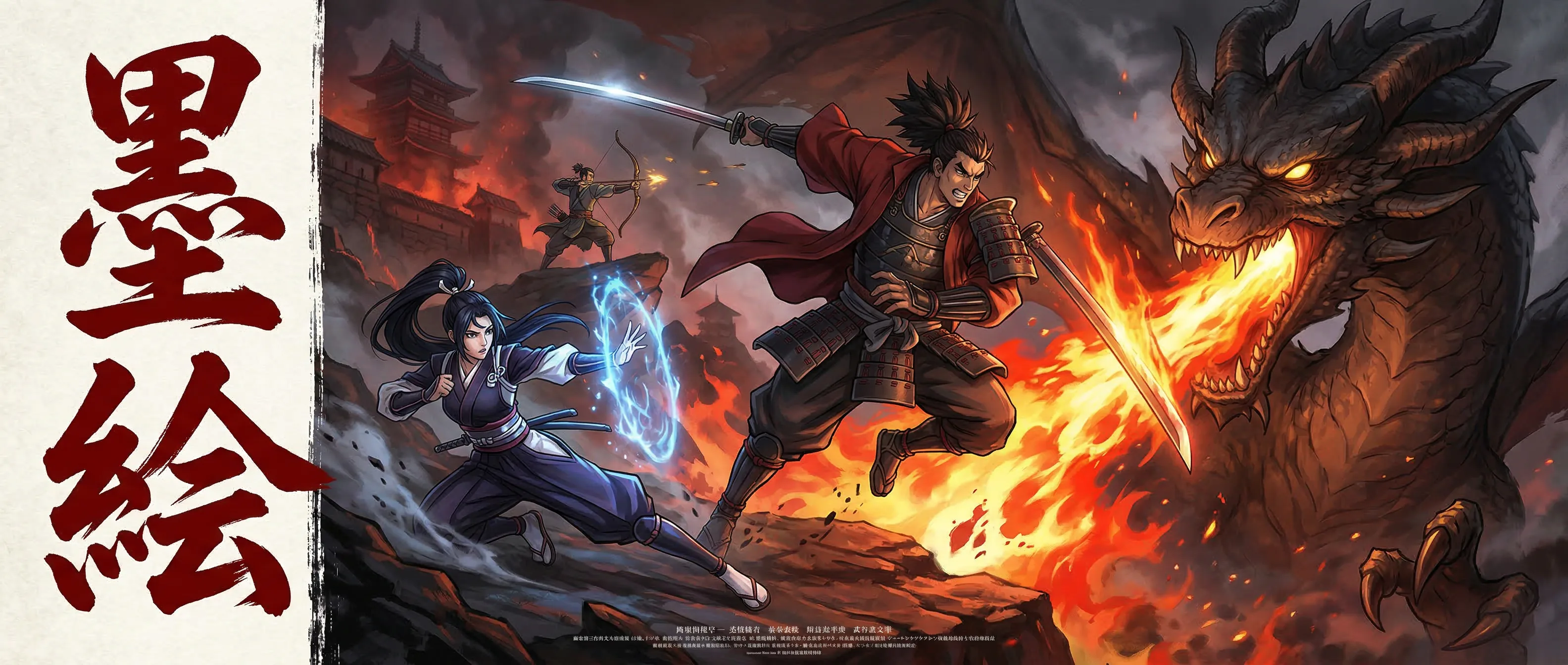
Panel Layout Mastery: Pacing, Flow, and Visual Storytelling in Manga Composition
A comprehensive guide to manga panel design — how panel size, shape, arrangement, and gutter width control reading pace, emotional weight, and narrative flow, with practical techniques using SumiSketch's template system.
The Invisible Architecture of Sequential Art
A manga page is not a collection of drawings arranged in a grid. It is a temporal instrument — a sequence of carefully sized, shaped, and positioned visual containers that control how the reader experiences the story in time. The panels are the architecture; the art within them is the content. And just as great architecture shapes how people move through a building without their conscious awareness, great panel layout shapes how readers move through a story without their conscious awareness. The layout is felt, not seen.
Beginning manga artists focus almost exclusively on what is inside the panels — the character drawing, the inking, the screen tones. Professional mangaka spend equal or greater attention on the panels themselves: how large each panel should be relative to the others on the page, what shape communicates the right emotional weight, how the arrangement guides the reader's eye from one beat to the next, and how the transitions between panels control narrative pacing. These decisions are made before a single character is drawn, because the panel layout is the foundation that determines whether the art inside the panels will land with impact or pass without notice.
SumiSketch's template system provides 18+ manga panel templates, webtoon templates, 4-koma templates, and a custom grid creator that gives you full control over panel composition. But templates are starting points, not solutions. This guide teaches the principles behind the templates — the visual storytelling logic that determines when to use a wide establishing panel versus a tall action panel, when to break the grid versus when to maintain it, and how to use panel rhythm to create the pacing that makes readers turn pages. The principles apply whether you are working in traditional manga format, vertical webtoon format, or the four-panel 4-koma structure.
Panel Size and Reading Time: Controlling Pacing
The most fundamental principle of panel layout is that panel size controls reading time. A large panel takes longer to absorb — the reader's eye travels across more visual information, lingers on more detail, and processes a larger composition. A small panel is consumed quickly — the eye enters, registers the content, and moves to the next panel in a fraction of a second. This relationship between size and time is the primary tool for controlling narrative pacing.
A page of uniformly sized panels reads at a metronomic pace — every beat has equal weight, equal duration. This is rarely desirable because stories are not metronomic. Some moments should linger: a character's emotional reaction, a landscape establishing a new location, the aftermath of an action sequence. Other moments should flash by: rapid exchanges of dialogue, a series of quick actions, montage sequences that compress time. The variation in panel size creates the variation in pacing that makes the story feel alive.
SumiSketch's panel templates encode common pacing patterns. A template with one large panel at the top and three smaller panels at the bottom creates a page that opens with a slow, establishing beat and then accelerates into quick narrative progression. A template with small panels at the top that lead into a single large panel at the bottom creates a build-up that culminates in a dramatic payoff. A template with panels that progressively increase in size from top to bottom creates an expanding sense of tension or revelation. Each template is not just an arrangement — it is a pacing structure.
The practical technique is to plan your panel sizes before you draw. For each page, write down the narrative beats in order. Mark which beats are high-impact (these get large panels) and which are transitional or fast-paced (these get small panels). Then select or customize a SumiSketch template that matches this pacing map. The common mistake is to make all panels roughly the same size because it is easier to draw — the result reads flat, with every moment carrying the same visual weight regardless of its narrative importance. Resist this default. The size variation is what makes the page read like a story rather than a storyboard.
Panel size controls reading time. A page of uniformly sized panels reads at a metronomic pace — every beat has equal weight. Real stories need variation, and size variation is the primary tool for creating it.
18+ Panel Templates
Pre-designed page layouts encoding common pacing patterns — from slow establishing pages to rapid-fire action sequences to dramatic build-and-payoff structures.
Custom Grid Creator
Full control over panel count, size ratios, and arrangement when no template matches your pacing requirements — create any layout structure you can imagine.
Panel Shape and Emotional Tone: The Psychology of Rectangles
Beyond size, the shape of a panel communicates emotional information that the reader processes subconsciously. Wide, horizontal panels create a sense of calm, space, and panoramic awareness — they are the visual equivalent of taking a breath. Tall, vertical panels create a sense of height, power, drama, and focused attention — they are the visual equivalent of looking up in awe or staring down in dread. Square panels feel balanced and neutral — they communicate information without imposing a specific emotional direction.
The psychological basis for these associations is rooted in how humans experience physical space. Wide horizons are associated with open landscapes, safety, and contemplation — hence the calming effect of horizontal panels. Tall vertical spaces are associated with skyscrapers, waterfalls, trees, and standing figures — hence the dramatic, imposing quality of vertical panels. Artists who understand these associations can use panel shape to reinforce the emotional content of the scene without the reader consciously noticing the technique.
Diagonal and irregular panel shapes break the grid and create tension, urgency, and disorientation. A panel border that tilts introduces visual instability — the reader perceives that something is off, that the normal order has been disrupted. This technique is used sparingly but effectively during action sequences, psychological distress scenes, and moments of chaos or transformation. SumiSketch's custom grid creator allows you to create angled panel borders, overlapping panels, and borderless bleeds that extend to the page edge — all techniques for breaking the expected grid when the story demands it.
A practical application: consider a scene where a character receives shocking news. A common layout would be three panels — the character's calm face, the news being delivered, the character's shocked reaction. But panel shape can amplify this sequence dramatically. Make the first panel wide and horizontal (calm, stable). Make the second panel narrow and tall, cutting the width to create visual compression (sudden, focused). Make the third panel the largest on the page, potentially breaking the borders or bleeding to the edge (the shock expands beyond containment). The same three drawings in three equal squares would communicate the information, but the shaped panels communicate the emotion.
Webtoon Templates
Vertical-scroll optimized layouts that use horizontal width and vertical spacing to control pacing in the webtoon format's unique reading rhythm.
4-Koma Templates
Four-panel comedy strip layouts with precise proportions for the setup-development-twist-punchline comedic structure.
Reading Flow and Eye Direction: Guiding the Reader's Path
Manga reads right-to-left, top-to-bottom. Webtoons read top-to-bottom in a continuous vertical scroll. Western comics read left-to-right, top-to-bottom. Regardless of the reading direction, the panel layout must create an unambiguous path for the reader's eye to follow. Ambiguous layouts — where the reader is unsure whether to move right or down, or where two panels compete for attention simultaneously — break the reading experience and pull the reader out of the story.
The primary tool for guiding reading flow is panel alignment. Panels whose top edges align are read as a horizontal row — the eye moves across them before dropping to the next row. Panels that break this alignment — one panel that is taller than its neighbors and extends into the next row — create a visual bridge that guides the eye downward. Professional mangaka use this bridging technique deliberately to control the page's reading rhythm. A tall panel in the middle of a page can serve as a visual anchor that divides the page into an upper sequence and a lower sequence, or it can connect across rows to create a diagonal reading path that speeds up the pace.
Gutter width — the space between panels — is the second tool for controlling flow. Narrow gutters (the minimum visible separation) create a rapid, connected reading rhythm — the panels feel close together in time and space, suggesting continuous action or rapid dialogue. Wide gutters create pauses — the reader's eye crosses more empty space, which the brain interprets as elapsed time. Very wide gutters can suggest long time passages, scene changes, or contemplative moments. SumiSketch's templates use calibrated gutter widths that match professional manga standards, but the custom grid creator allows you to adjust gutter width per panel boundary for fine-grained pacing control.
A useful exercise for developing layout intuition: take a published manga page you admire and trace only the panel borders and gutters, ignoring the art. What you see is the page's temporal structure — the skeleton of pacing decisions that supports the content. Note how panel sizes vary, how shapes create emotional direction, and how the eye path is guided from first panel to last. Then attempt to create a similar temporal structure in SumiSketch's custom grid creator for your own story. The ability to separate layout decisions from drawing decisions is the skill that distinguishes professional sequential artists from illustrators who happen to arrange their work in panels.
Gutter width controls reading rhythm. Narrow gutters create rapid, connected pacing — panels close in time. Wide gutters create pauses the brain interprets as elapsed time. This invisible space shapes the story's tempo.
Advanced Layout Techniques: Breaking the Rules With Purpose
The grid is a tool, not a prison. The most powerful panel layouts in manga history are those that break the grid at precisely the right moment — a full-page spread that interrupts a sequence of standard panels, a borderless panel that bleeds across the page, panels that overlap to create simultaneous action, or a completely empty page that follows a page of dense action. These rule-breaking layouts work because they are exceptions to an established norm. If every page breaks the grid, there is no grid to break, and the technique loses its power.
The full-page panel (a single image filling the entire page) is the most dramatic layout tool available. It completely stops the reading rhythm — the reader cannot scan past it because there is nowhere to scan to. Use it for moments of maximum impact: the reveal of a villain, the destruction of a landscape, a character at the peak of emotional intensity. In SumiSketch, you can achieve this by using a single-panel template or by removing all grid lines in the custom grid creator. The key is restraint: a full-page panel used once every 20 pages is devastating; used every other page, it becomes ordinary.
Overlapping panels — where one panel partially covers another — create a sense of action breaking through the structure of the page. The panel that sits on top feels closer to the reader, more immediate, more urgent than the panel underneath. This technique is effective during fight scenes, chase sequences, and moments where a character's action dominates the narrative so completely that it overflows the normal panel structure. SumiSketch's layer system allows you to create overlapping panels by drawing content that crosses panel boundaries on a layer above the panel template.
Panel-less sequences — drawings that float on the page without borders — create an ethereal, dreamlike quality. Without the hard edges of panel borders, the images feel less anchored in time and space. Use this technique for flashback sequences, dream sequences, internal monologues, and poetic or contemplative passages. The contrast between bordered and borderless content tells the reader, without any text, that the narrative has shifted from the concrete present to something more subjective or internal. SumiSketch's perspective grid tools continue to function in borderless compositions, maintaining structural accuracy even when the panel structure is deliberately relaxed.
Character Sheet Templates
Multi-view character reference layouts for maintaining visual consistency when the same character appears across hundreds of panels in varying compositions.
Perspective Grid System
1, 2, and 3-point perspective grids that snap to panel boundaries — maintaining spatial accuracy even in complex, rule-breaking layouts.
Format-Specific Layout Strategies
Panel layout conventions differ significantly between traditional manga, webtoon, and 4-koma formats, and SumiSketch provides templates optimized for each. Understanding the format-specific conventions ensures that your layouts feel native to the format rather than awkwardly adapted from another tradition.
Traditional manga pages use the full toolkit of panel variation — size, shape, orientation, gutters, and grid-breaking techniques — within a fixed page dimension. The constraint of the page boundary is creatively productive: the page turn is a dramatic tool (the most impactful panel on a two-page spread should be on the left page, which is revealed when the reader turns the page), and the page acts as a natural unit of pacing. Each page should have a clear entry point, a coherent internal flow, and an exit that draws the reader to turn to the next page.
Webtoon format eliminates the page boundary in favor of a continuous vertical scroll. This changes the pacing model fundamentally. Without page turns, the panel-to-panel flow becomes the only pacing mechanism. Webtoon panels tend to be wider and more uniformly horizontal, with vertical spacing (the equivalent of gutters) controlling reading pace. Large amounts of vertical whitespace between panels create dramatic pauses that are the webtoon equivalent of a page-turn reveal. SumiSketch's webtoon templates are optimized for this vertical rhythm, using panel height and inter-panel spacing as the primary pacing controls.
The 4-koma format — four panels stacked vertically — imposes the most rigid structural constraint, and that constraint is its strength. The four-panel structure maps naturally to the comedic structure of setup, development, twist, and punchline (ki-sho-ten-ketsu). Each panel has a defined narrative role, and the artist's craft lies in maximizing the impact of each beat within the fixed structure. SumiSketch's 4-koma templates provide the precise proportions that professional 4-koma artists use, with the third panel (the twist) typically given slightly more visual weight than the first two. The daily challenge prompts in SumiSketch work exceptionally well in 4-koma format, providing practice in the economical storytelling that the format demands.
The page turn is a dramatic tool in traditional manga. The most impactful panel should be on the left page, revealed when the reader turns the page — a design decision made during layout, not during drawing.
SumiSketch — Coming Soon
80 professional tools. Free at launch. No ads. No premium tier.